Responsive Web Design
Websites built with responsive design adjust their layout to make your site readable and easy to navigate whether a user is holding an iPad, an Android device or a 17-inch laptop computer. They incorporate certain visual design and development practices to detect the screen size and resolution on a user’s device and make a site “respond” in a way that preserves your intended experience while adapting from click to touch. Tactics include automatically resizing images and text, rearranging elements (columns) to stack vertically based on priority and nesting navigation menus to free up space on tiny screens.
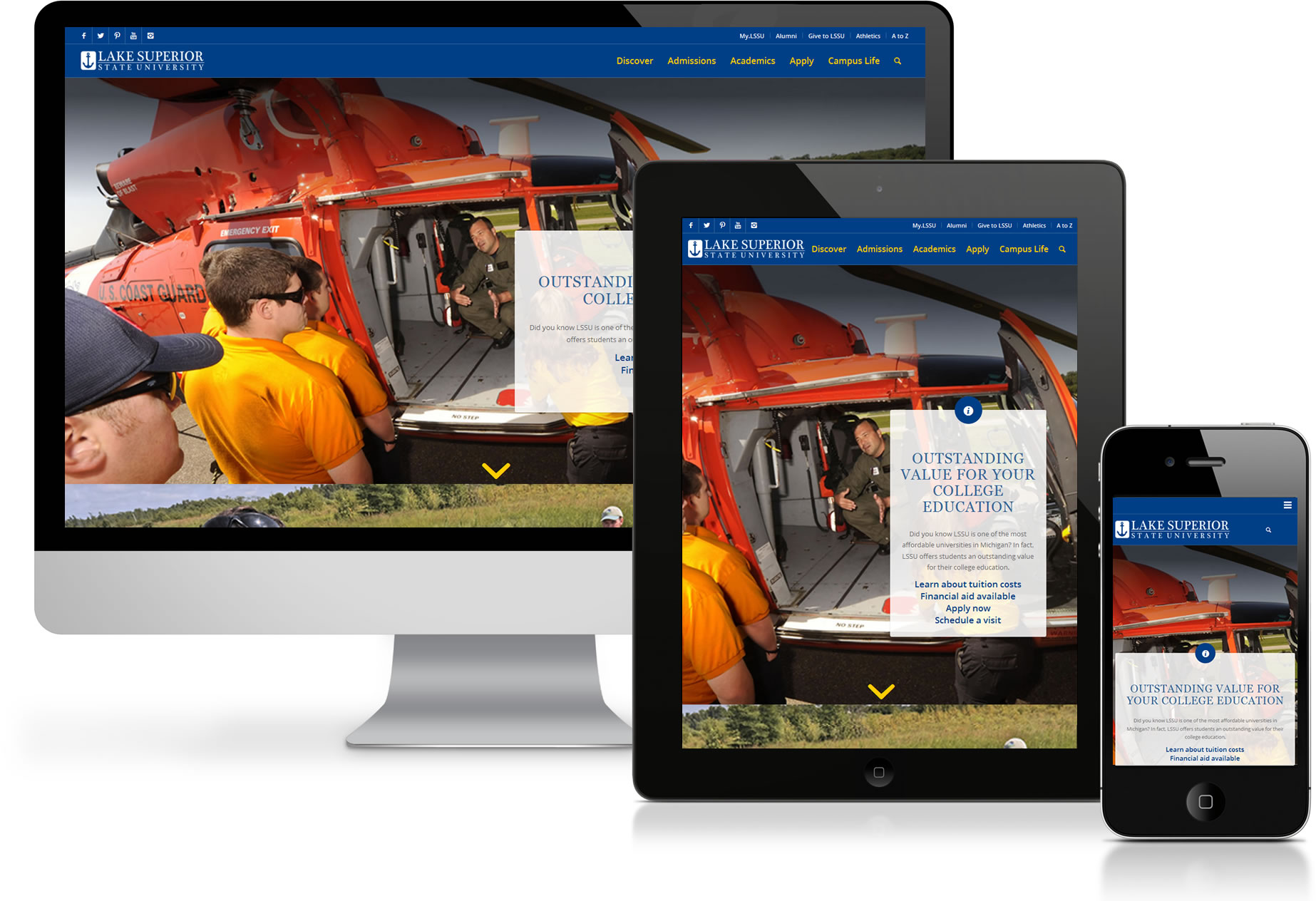
A responsive website is an alternative to building websites for all shapes and sizes of devices. As it uses a same source of content and a single set of templates, responsive design is often more efficient and easier to maintain than separate mobile and desktop sites, for example.
Google is forecasting that traffic to your website from mobile devices (smartphones and tablets) will exceed traffic from desktops and laptops within the next one to two years. Of course the same person who uses your website from a laptop on Wednesday may be looking up something on your site from their iPhone that weekend. It’s often the same person interacting with you across all of these formats. The mobile and desktop web experience need to be conceived as a whole. But we don’t think it’s enough just to be mobile “friendly.” Your website should be mobile “smart.”Responsive design impacts a user’s experience on lssu.edu in a number of ways:
- A simpler, cleaner design aesthetic. Desktop web design has trended over the years towards maximizing the use of screen real estate. Mobile assumes people are on the go, with limited time to focus and a need to get right to the point. Interface design is therefore more clean and concise, with limited choices on screen at any given time.
- Everything should be more “touch” friendly. Tiny, densely packed links don’t support fingertips well. Buttons and links need to be big and obvious.
- Interaction should be simple but powerful. Forms aren’t much fun on mobile devices, so interactions should minimize data entry. But people still want to interact. Keep it as simple as tapping through menus, taking a photo, or sending a text.
- Emphasis on photos and video. Mobile doesn’t have to be boring text. Users are quick to engage with multimedia on mobile.
- Context becomes more important. Before we could assume most people were sitting down somewhere when they visit a website. Now they’re likely to be anywhere, doing anything.
- Some content will have to be shorter, or edited for shorter paragraphs. People consume content differently on a mobile devices.